Nathalie works with people carrying real responsibility: leaders facing complex decisions and coaches reflecting on their own practice. Her identity needed to make that depth of experience visible while conveying how she works: precise, direct and on equal footing. Our challenge was to create a presence that holds professional seriousness and human warmth together.
We began with the balance at the heart of Nathalie’s work: analytical precision and human connection. A bold wordmark gives her name presence, while clear typography keeps the communication open and readable. Warm off-white, deep brown and muted greens establish a grounded setting that reflects her considered approach to complex situations.
The pink is Nathalie’s spark. We chose it to express her energy, humour and distinctive combination of depth and lightness. Against the softer palette, it adds a confident personal note and directs attention to key invitations. We brought the same balance into the website, giving her background, coaching formats and working principles a clear structure. The design creates room for substantial content while making the first step towards a conversation feel approachable.


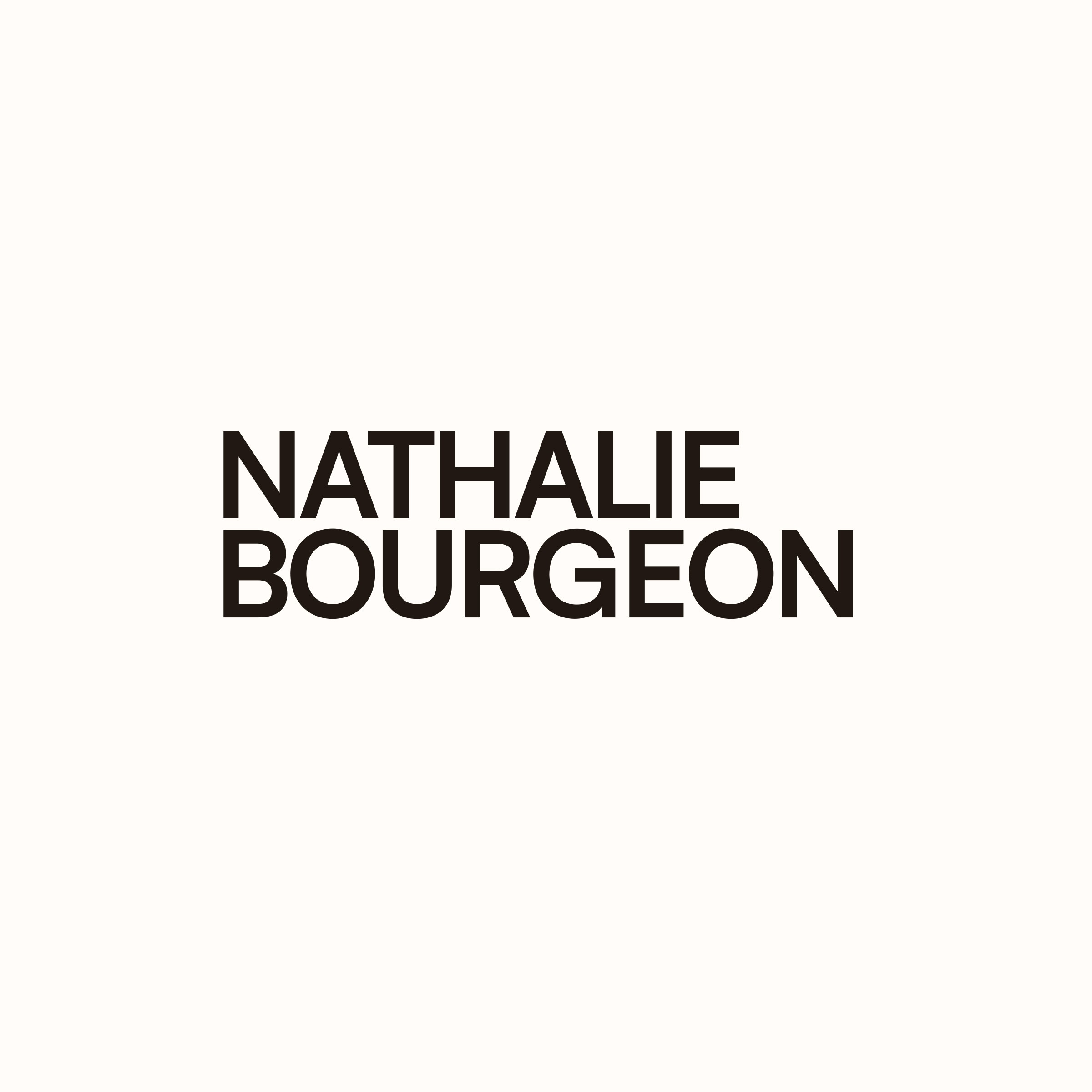

The result is a brand and website that connect Nathalie’s professional background with the work she does today. Her experience has a clear place in the story, alongside leadership sparring, intensive coaching and supervision for other coaches. Visitors can understand both what she offers and the perspective she brings to it.
The visual identity gives these different aspects a consistent expression. Its calm foundation reflects the space she creates for reflection, difficult conversations and fresh thinking. Pink brings her lively, unmistakable presence into that setting. By developing the identity and website together, we gave her coaching business a coherent foundation that feels assured, approachable and deeply personal.
The project in numbers:
Colours in the identity palette
Professional perspectives united
Complementary typefaces
Complete new website
Olaf Haarsma, Tanja Lenz